Today we will make an AMAZING REPORT with the brand new
Power BI Gantt Custom Visual.
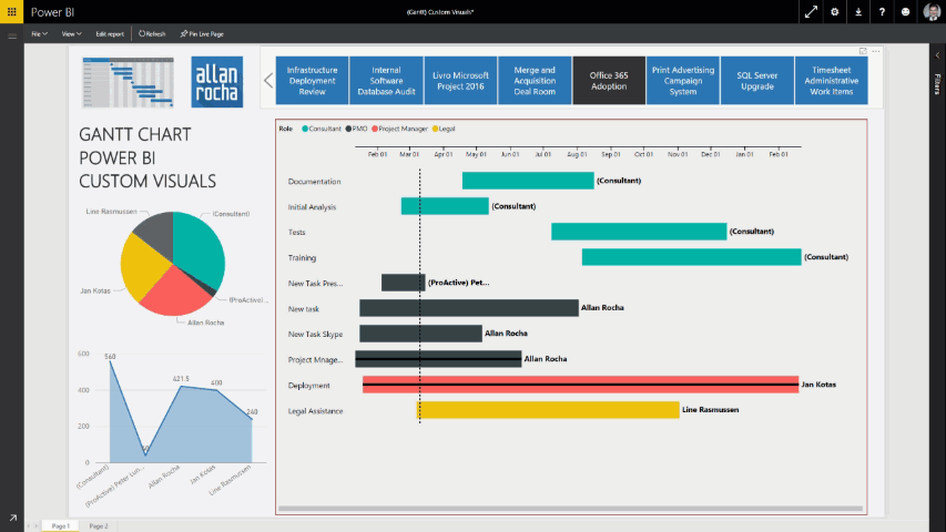
| Gantt Published by Microsoft A Gantt chart is a type of bar chart which illustrates a project timeline or schedule. The Gantt Chart visual shows the Tasks, Start Dates, Durations, % Complete, and Resources for a project. The Gantt Chart visual can be used to show current schedule status using percent-complete shadings and a vertical “TODAY” line. The Legend may be used to group or filter tasks based upon data values. |
So, this visual is mostly what we are going to use today!
Let’s get started:
- First of all, download the Power BI Custom Visual Gantt: https://app.powerbi.com/visuals/
- Make sure you have the latest version of Power BI Desktop, in case you are using it.
- If you want to create the report directly into Power BI, you are always using the latest version!

- Under visualizations, click on Import.

- Select you Gantt.pbiviz file


- Click on the Gantt icon, under visualizations, to add the visual
-
Look at the fields available for this chart
- Legend
- Task
- Start Date
- Duration
- % Completion
- Resource

-
I’m using the following tables for this chart
- Assignments
- Resources
- Tasks
-
I’m placing the fields on the following order:
- Legend: Role (Resource)
- Task: TaskName (Assignments)
- Start
Date: AssignmentStartDate (Assignments) - Duration: TaskDuration (Tasks)
- %
Completion: TaskPercentWorkCompleted (Tasks) - Resource: ResourceName (Resources)

- Add some extra charts, slicers and make it look good
- DONE!
- You have now your Power BI Gantt Chart ready to use!

- Let’s publish to Power BI by clicking on Publish.


- Access your Power BI Report
- Remember to Enable custom visuals.


- Enjoy the quick gif showing how cool it is in real life:
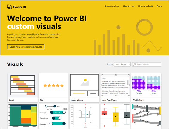
In case you don’t know, Power BI has a gallery of visuals created by the Power BI community.
you can browse through the visuals or submit one of your own for others to use. SUPER COOL!
https://app.powerbi.com/visuals/